Drawing Conclusions from Graphs & Tables
Practice Questions
SAT Math › Drawing Conclusions from Graphs & Tables
The below tables show the way that a certain high school converts letter grades to numerical grades, and the math grades of a particular high school’s 65-person graduating class.
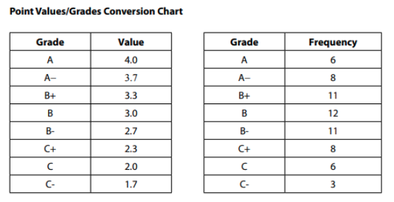
Which of the following best describes the data outlined in the tables?
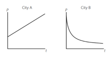
A census bureau has modeled the population change of two cities, City A and City B, and published the graphs of the models as shown above. The graphs display population (p) over time (t), and the mathematical models use the variables p (population), B (beginning population as of the initial census in the year 1900), x (annual percent change), and y (number of years). Which of the following pairs of equations best explains the relationships demonstrated in the graphs?
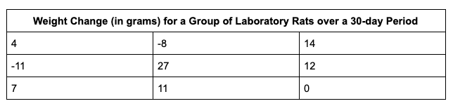
The table above gives the weight change measurements of 9 laboratory rats that were fed different diets under a variety of conditions over 30 days.
After all of the measurements were taken for the nine rats, researchers discovered that the scale used to measure the rats at the close of the experiment under weighed all of them by exactly 5 grams. Which of the following statistical values would change after 5 grams are added to each of the measurements above?
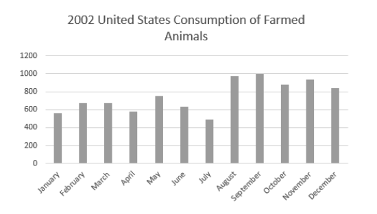
Which of the following would be the most appropriate label for the y-axis of this graph if the total number of farmed animals in 2002 was closest to 9 billion?
The below tables show the way that a certain high school converts letter grades to numerical grades, and the math grades of a particular high school’s 65-person graduating class.

Henry, one of the students at the school, wants to achieve a 3.5-grade point average or better for the semester. If he takes five classes, and his grades for four of them are A−, A−, B+, and B, what is the lowest grade that he can receive for his fifth class and still achieve his goal?
The table below displays the class status and declared major for the 37,500 undergraduate students at a state university.

Of the freshmen who have declared a major, approximately what percent have chosen a major in the sciences?
Which of the following expresses a strong positive correlation between W and T?
The table below displays the class status and declared major for the 37,500 undergraduate students at a state university.
For which class rank (freshman/sophomore/junior/senior/5th) is the ratio of arts majors to science majors the highest?
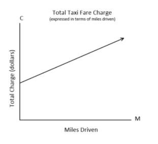
The graph above displays the charge “C” in dollars of riding a taxi for “M” miles.
According to the graph, what does the C-intercept represent?
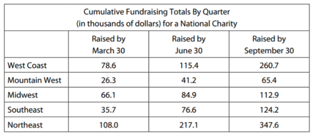
The chart above shows the cumulative fundraising totals, in thousands of dollars, for each of five regions. If the charity has a total fundraising goal of one million dollars for the year, approximately what percent of its goal had the charity achieved by September 30?