Line Graphs
Practice Questions
GED Math › Line Graphs
The following graph charts the amount of rain received per month over the span of a year.
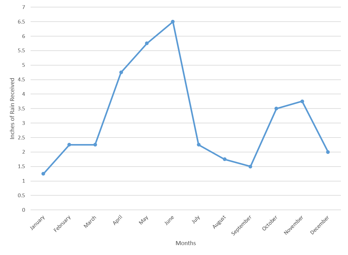
What is the median amount of rainfall in the last six months of the year?
The following graph charts the number of attendees at a theme park over the course of a year.
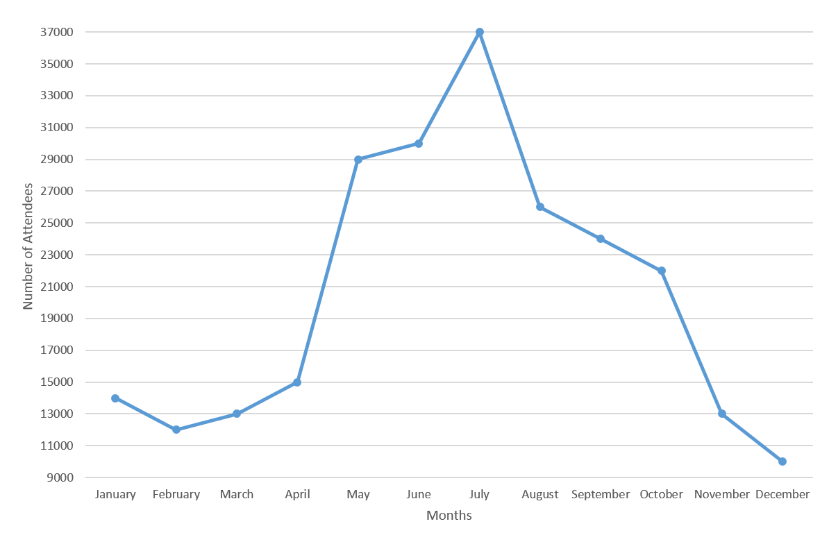
The increase in the number of attendees between April and May is how much larger than the increase in the number of attendees between June and July?
The following graph charts the number of attendees at a theme park over the course of a year.
By what percentage did attendance at the park increase from April to May?
Use the following line graph to answer the question:
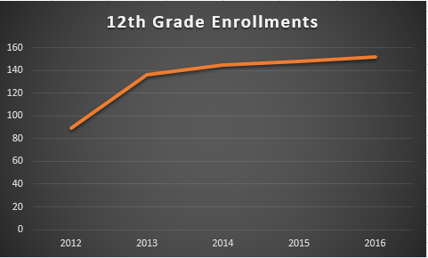
Approximately, how many 12th grade enrollments were there in 2013?
The following graph charts the amount of rain received per month over the span of a year.
What is the average amount of rain, in inches, received in the first six months of the year?
Use the following line graph to answer the question:
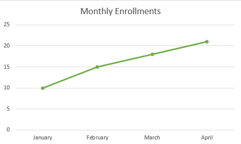
How many enrollments were there in January?
The following graph charts the amount of rain received per month over the span of a year.
By what percent did the amount of rainfall increase between March and April?
The following graph charts the number of attendees at a theme park over the course of a year.
What is the average number of attendees from March to August, inclusive?
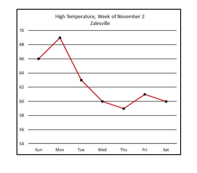
Refer to the above line graph, which tracks the high temperature in a town over one calendar week.
Of the days shown, between which two consecutive days did the peak temperature decrease the most?
Refer to the above line graph, which tracks the high temperature in a town over one calendar week.
Of the days shown, how many had a peak temperature at or above 