Statistics & Probability
Practice Questions
Common Core: 8th Grade Math › Statistics & Probability
Mr. Miller conducted a statistical experiment to determine the relationship between final grades and the number of school days that his students missed. In this study, he assigned the number of missed school days as the independent variable, and the final grade was assigned as the dependent variable. Every student started the class with a 

Mr. Miller conducted a statistical experiment to determine the relationship between final grades and the number of school days that his students missed. In this study, he assigned the number of missed school days as the independent variable, and the final grade was assigned as the dependent variable. Every student started the class with a
A teacher at a high school conducted a survey of seniors and found that 


A teacher at a high school conducted a survey of seniors and found that
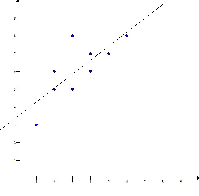
Select the scatter plot that shows the most accurate line of best fit.
Select the scatter plot that shows the most accurate line of best fit.
This scatter plot represents data about snack quality (

I. The price of a higher quality snack tends to be higher.
II. Points below the line represent snacks whose price is higher than their quality.
III. Points above the line represent snacks whose quality is higher than their price.
Which of the following represents a positive association in a scatterplot?
A scatterplot correlates adult males' height vs. shoe size. What does the point ")
The scatter plot provided displays a group of students' test scores versus the number of missing assignments the students have. Based on plot, select the answer choice with the data point that if added to the graph, would be an outlier.
