Basic Statistics - Algebra II
Card 0 of 20
Draw a Box and Whisker plot for the following data set.

Draw a Box and Whisker plot for the following data set.
Put the data in numerical order (from smallest to largest) if it isn't already. In order to find the median, divide the data into two halves. In order to divide the values into quartiles, find the median of the two halves.

1st quartile:  ,
,  ,
, 
Median of 1st quartile: 
2nd quartile = Median of total set: 
3rd quartile:  ,
,  ,
, 
Median of 3rd quartile: 
To construct the Box and Whisker Plot we use the minimum and the maximum value in the data set as the ends of the whiskers. To construct the box, we plot a line at the median of the 1st quartile, the median of our total data set, and at the median of the 3rd quartile. Then we connect the tops and bottom of the lines. The result is as follows:
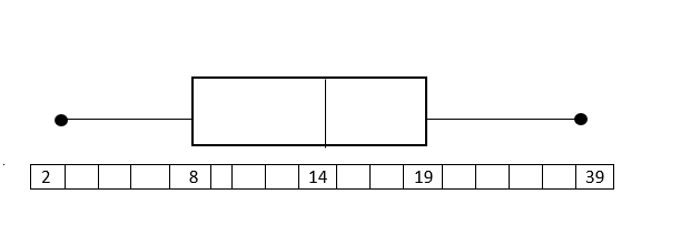
The endpoints (black dots) represent the smallest and largest values, in this case, 2 and 39.
Put the data in numerical order (from smallest to largest) if it isn't already. In order to find the median, divide the data into two halves. In order to divide the values into quartiles, find the median of the two halves.
1st quartile:
Median of 1st quartile:
2nd quartile = Median of total set:
3rd quartile:
Median of 3rd quartile:
To construct the Box and Whisker Plot we use the minimum and the maximum value in the data set as the ends of the whiskers. To construct the box, we plot a line at the median of the 1st quartile, the median of our total data set, and at the median of the 3rd quartile. Then we connect the tops and bottom of the lines. The result is as follows:
The endpoints (black dots) represent the smallest and largest values, in this case, 2 and 39.
Compare your answer with the correct one above
Draw a Box and Whisker plot for the following data set.

Draw a Box and Whisker plot for the following data set.
Put the data in numerical order (from smallest to largest) if it isn't already. In order to find the median, divide the data into two halves. In order to divide the values into quartiles, find the median of the two halves.
1st quartile: 
Median of 1st quartile: 
2nd quartile = Median: 
3rd quartile:
Median of 3rd quartile: 
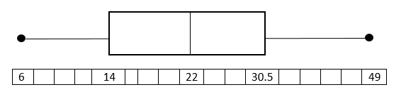
To construct the Box and Whisker Plot we use the minimum and the maximum value in the data set as the ends of the whiskers. To construct the box, we plot a line at the median of the 1st quartile, the median of our total data set, and at the median of the 3rd quartile. Then we connect the tops and bottom of the lines. The result is as follows:
Put the data in numerical order (from smallest to largest) if it isn't already. In order to find the median, divide the data into two halves. In order to divide the values into quartiles, find the median of the two halves.
1st quartile:
Median of 1st quartile:
2nd quartile = Median:
3rd quartile:
Median of 3rd quartile:
To construct the Box and Whisker Plot we use the minimum and the maximum value in the data set as the ends of the whiskers. To construct the box, we plot a line at the median of the 1st quartile, the median of our total data set, and at the median of the 3rd quartile. Then we connect the tops and bottom of the lines. The result is as follows:
Compare your answer with the correct one above
Draw a box and whisker plot for the following data set.

Draw a box and whisker plot for the following data set.
Put the data in numerical order (from smallest to largest) if it isn't already. In order to find the median, divide the data into two halves. In order to divide the values into quartiles, find the median of the two halves.
1st quartile: 
Median of 1st quartile: 
2nd quartile = Median: 
3rd quartile: 
Median of 3rd quartile: 
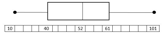
To construct the Box and Whisker Plot we use the minimum and the maximum value in the data set as the ends of the whiskers. To construct the box, we plot a line at the median of the 1st quartile, the median of our total data set, and at the median of the 3rd quartile. Then we connect the tops and bottom of the lines. The result is as follows:
Put the data in numerical order (from smallest to largest) if it isn't already. In order to find the median, divide the data into two halves. In order to divide the values into quartiles, find the median of the two halves.
1st quartile:
Median of 1st quartile:
2nd quartile = Median:
3rd quartile:
Median of 3rd quartile:
To construct the Box and Whisker Plot we use the minimum and the maximum value in the data set as the ends of the whiskers. To construct the box, we plot a line at the median of the 1st quartile, the median of our total data set, and at the median of the 3rd quartile. Then we connect the tops and bottom of the lines. The result is as follows:
Compare your answer with the correct one above
Draw a Box and Whisker plot for the following data set.

Draw a Box and Whisker plot for the following data set.
Put the data in numerical order (from smallest to largest) if it isn't already. In order to find the median, divide the data into two halves. In order to divide the values into quartiles, find the median of the two halves.
1st quartile: 
Median of 1st quartile: 
2nd quartile= Median: 
3rd quartile: 
Median of 3rd quartile: 
To construct the Box and Whisker Plot we use the minimum and the maximum value in the data set as the ends of the whiskers. To construct the box, we plot a line at the median of the 1st quartile, the median of our total data set, and at the median of the 3rd quartile. Then we connect the tops and bottom of the lines.
Put the data in numerical order (from smallest to largest) if it isn't already. In order to find the median, divide the data into two halves. In order to divide the values into quartiles, find the median of the two halves.
1st quartile:
Median of 1st quartile:
2nd quartile= Median:
3rd quartile:
Median of 3rd quartile:
To construct the Box and Whisker Plot we use the minimum and the maximum value in the data set as the ends of the whiskers. To construct the box, we plot a line at the median of the 1st quartile, the median of our total data set, and at the median of the 3rd quartile. Then we connect the tops and bottom of the lines.
Compare your answer with the correct one above
Draw a Box and Whisker plot for the following data set.

Draw a Box and Whisker plot for the following data set.
Put the data in numerical order (from smallest to largest) if it isn't already. In order to find the median, divide the data into two halves. In order to divide the values into quartiles, find the median of the two halves.
1st quartile: 
Median of 1st quartile: 
2nd quartile = Median: 
3rd quartile: 
Median of 3rd quartile: 
To construct the Box and Whisker Plot we use the minimum and the maximum value in the data set as the ends of the whiskers. To construct the box, we plot a line at the median of the 1st quartile, the median of our total data set, and at the median of the 3rd quartile. Then we connect the tops and bottom of the lines. The result is as follows:
Put the data in numerical order (from smallest to largest) if it isn't already. In order to find the median, divide the data into two halves. In order to divide the values into quartiles, find the median of the two halves.
1st quartile:
Median of 1st quartile:
2nd quartile = Median:
3rd quartile:
Median of 3rd quartile:
To construct the Box and Whisker Plot we use the minimum and the maximum value in the data set as the ends of the whiskers. To construct the box, we plot a line at the median of the 1st quartile, the median of our total data set, and at the median of the 3rd quartile. Then we connect the tops and bottom of the lines. The result is as follows:
Compare your answer with the correct one above
Draw a Box and Whisker plot for the following data set.

Draw a Box and Whisker plot for the following data set.
Put the data in numerical order (from smallest to largest) if it isn't already. In order to find the median, divide the data into two halves. In order to divide the values into quartiles, find the median of the two halves.
1st quartile: 
Median of 1st quartile: 
2nd quartile = Median: 
3rd quartile: 
Median of 3rd quartile: 
To construct the Box and Whisker Plot we use the minimum and the maximum value in the data set as the ends of the whiskers. To construct the box, we plot a line at the median of the 1st quartile, the median of our total data set, and at the median of the 3rd quartile. Then we connect the tops and bottom of the lines. The result is as follows:
Put the data in numerical order (from smallest to largest) if it isn't already. In order to find the median, divide the data into two halves. In order to divide the values into quartiles, find the median of the two halves.
1st quartile:
Median of 1st quartile:
2nd quartile = Median:
3rd quartile:
Median of 3rd quartile:
To construct the Box and Whisker Plot we use the minimum and the maximum value in the data set as the ends of the whiskers. To construct the box, we plot a line at the median of the 1st quartile, the median of our total data set, and at the median of the 3rd quartile. Then we connect the tops and bottom of the lines. The result is as follows:
Compare your answer with the correct one above

The box and whisker plot above can be used to find all of the following information about the data set that it describes except:
The box and whisker plot above can be used to find all of the following information about the data set that it describes except:
The median value of the data set, 86, is represented by the dashed line inside the box.
The maximum and minimum of the data set, 100 and 75 (respectively), are found at the far ends of the 2 whiskers on either end.
The range of the data set is found by subtracting the minimum from the maximum; 100-75=25, so the range is 25.
The upper and lower quartiles are given by the two boundaries between the box and the whiskers: the lower quartile (1st quartile) is the left boundary, 80 in the data set; the upper quartile (3rd quartile) is the right boundary, which is 92 in the data set.
All of the other choices are provided by the box and whisker plot, so the correct choice is "The box and whisker plot gives you all of these"
Compare your answer with the correct one above
What is the next number in this sequence: 8, 27, 64, 125 ?
What is the next number in this sequence: 8, 27, 64, 125 ?
Find the pattern of the sequence:
This pattern is  so the next number in the sequence would be
Find the pattern of the sequence:
This pattern is
Compare your answer with the correct one above
Find the next 2 numbers in this sequence: 33, 46, 72, 111
Find the next 2 numbers in this sequence: 33, 46, 72, 111
Find the pattern in this sequence of numbers:
In this case, the pattern is adding 13n to the previous number where n= how many numbers came before the current number.
, 72+(13 \times 3)")
so the first number we are looking for would be:
=163")
the second number we are looking for would be:
=228")
Find the pattern in this sequence of numbers:
In this case, the pattern is adding 13n to the previous number where n= how many numbers came before the current number.
so the first number we are looking for would be:
the second number we are looking for would be:
Compare your answer with the correct one above
The amount of water inside of a leaky boat is measured periodically after the boat has been in the water in different periods of time and are found to have a linear relationship. The results are given in the following chart:
Time in water (mins) Amount of water in the boat (gal) 0 0 6 4.8 19 15.2 28 22.4
Using the method of linear extrapolation based on the data from the table, how much water would you expect to be in the boat after  minutes?
The amount of water inside of a leaky boat is measured periodically after the boat has been in the water in different periods of time and are found to have a linear relationship. The results are given in the following chart:
| Time in water (mins) | Amount of water in the boat (gal) |
|---|---|
| 0 | 0 |
| 6 | 4.8 |
| 19 | 15.2 |
| 28 | 22.4 |
Using the method of linear extrapolation based on the data from the table, how much water would you expect to be in the boat after 
To extrapolate the results of the study out to 53 minutes, first we have to determine an equation representing the relationship between time passed and amount of water; we can write our equation in slope-intercept form:

Where our y-axis represents amount of water and the x-axis represents time. We can pick 2 points and label them Point 1 and Point 2; looking back at the table:
Time in water (mins) Amount of water in the boat (gal) 0 0 6 4.8 19 15.2 28 22.4
We label Point 1 as ") and Point 2 as
and Point 2 as ") ; we plug these points into the slope formula as follows:
; we plug these points into the slope formula as follows:

So, the slope of our line that describes how much water is in the boat is  ; to find our
  term, the y-intercept, we need to pick a point on the graph and plug in our slope to solve for y-intercept. Let's once again choose the point
 ") :
:
(6)+b")
Simplify the expression and we find that b=0, so our slope-intercept equation is:
x")
Plugging in a value of 53 for  , we find that:
(53)=42.4")
So the answer is 42.4 gallons of water in the boat after 53 minutes.
To extrapolate the results of the study out to 53 minutes, first we have to determine an equation representing the relationship between time passed and amount of water; we can write our equation in slope-intercept form:
Where our y-axis represents amount of water and the x-axis represents time. We can pick 2 points and label them Point 1 and Point 2; looking back at the table:
| Time in water (mins) | Amount of water in the boat (gal) |
|---|---|
| 0 | 0 |
| 6 | 4.8 |
| 19 | 15.2 |
| 28 | 22.4 |
We label Point 1 as
So, the slope of our line that describes how much water is in the boat is
Simplify the expression and we find that b=0, so our slope-intercept equation is:
Plugging in a value of 53 for
So the answer is 42.4 gallons of water in the boat after 53 minutes.
Compare your answer with the correct one above
The number of runs scored per game by a little league baseball team is represented by the following frequency distribution:
Number of Runs Scored Frequency 0 5 1 2 2 7 3 9 4 3 5 0 6 4 7 2 8 2 9 1
Using this frequency table, select the correct answer of m ean runs scored by the little league team (rounded to the nearest hundredth).
The number of runs scored per game by a little league baseball team is represented by the following frequency distribution:
| Number of Runs Scored | Frequency |
|---|---|
| 0 | 5 |
| 1 | 2 |
| 2 | 7 |
| 3 | 9 |
| 4 | 3 |
| 5 | 0 |
| 6 | 4 |
| 7 | 2 |
| 8 | 2 |
| 9 | 1 |
Using this frequency table, select the correct answer of m ean runs scored by the little league team (rounded to the nearest hundredth).
Number of Runs Scored Frequency 0 5 1 2 2 7 3 9 4 3 5 0 6 4 7 2 8 2 9 1
To determine the mean, first the data set should be re-written in sequential order:

The formula to determine mean is:

The mean is approximately 3.37 runs scored per game.
| Number of Runs Scored | Frequency |
|---|---|
| 0 | 5 |
| 1 | 2 |
| 2 | 7 |
| 3 | 9 |
| 4 | 3 |
| 5 | 0 |
| 6 | 4 |
| 7 | 2 |
| 8 | 2 |
| 9 | 1 |
To determine the mean, first the data set should be re-written in sequential order:
The formula to determine mean is:
The mean is approximately 3.37 runs scored per game.
Compare your answer with the correct one above
Thousands of people in the United States were surveyed about their grandparents. This frequency table shows their answer to the question "how many of your grandparents were born outside of the US?
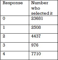
Of the people who had at least one grandparent born outisde of the US, what percent had exactly 3 non-US born grandparents?
Thousands of people in the United States were surveyed about their grandparents. This frequency table shows their answer to the question "how many of your grandparents were born outside of the US?
Of the people who had at least one grandparent born outisde of the US, what percent had exactly 3 non-US born grandparents?
Adding up the total number of grandparents that were born outside the U.S. is our first step in solving this problem.
There are
 people who said they had at least 1 grandparent born outside of the US. Of those, only 976 had exactly 3.
So
 or
or  is the answer.
Adding up the total number of grandparents that were born outside the U.S. is our first step in solving this problem.
There are
So
Compare your answer with the correct one above
Thousands of people in the United States were surveyed about their grandparents. This frequency table shows their answer to the question "how many of your grandparents were born outside of the US?"
Is this data normally distributed?
Thousands of people in the United States were surveyed about their grandparents. This frequency table shows their answer to the question "how many of your grandparents were born outside of the US?"
Is this data normally distributed?
No - normally distributed data has a low frequency of responses at the high and low ends. Also, the majority of the data is in the middle.
In this data set, the majority of people said "0," and the fewest people said "3" which is near the middle of the data. If this data was normally distributed we would have a higher frequency between 1 and 3 and much lower values for 0 and 4.
Compare your answer with the correct one above
What is the correct frequency distribution for this data set?
1 3 5 2 5 2 4 1 5
2 4 1 2 3 5 5 2 3
3 1 4 4 6 2 3 2 4
What is the correct frequency distribution for this data set?
1 3 5 2 5 2 4 1 5
2 4 1 2 3 5 5 2 3
3 1 4 4 6 2 3 2 4
Count the number of times each number appears in the data set.
The number 1 appears 4 times, so the first line is  .
.
Then number 2 appears 7 times, so the next line is  .
.
Continuing in this fashion we see that the numbers 3, 4, and 5 appears 5 times and 6 appears once.
Therefore combining these together we get the following answer:

Count the number of times each number appears in the data set.
The number 1 appears 4 times, so the first line is
Then number 2 appears 7 times, so the next line is
Continuing in this fashion we see that the numbers 3, 4, and 5 appears 5 times and 6 appears once.
Therefore combining these together we get the following answer:
Compare your answer with the correct one above
What is the mean of the data in this frequency table?
# Frequency
1 3
2 4
3 0
4 2
What is the mean of the data in this frequency table?
# Frequency
1 3
2 4
3 0
4 2
The frequency table represents the data set:
1, 1, 1, 2, 2, 2, 2, 4, 4.
The sum is 19 and there are 9 data points, so the mean is
 .
.
The frequency table represents the data set:
1, 1, 1, 2, 2, 2, 2, 4, 4.
The sum is 19 and there are 9 data points, so the mean is
Compare your answer with the correct one above
What is the median of the data in this frequency table?
# Frequency
1 3
2 4
3 0
4 2
What is the median of the data in this frequency table?
# Frequency
1 3
2 4
3 0
4 2
The frequency table represents the data set:
1, 1, 1, 2, 2, 2, 2, 4, 4.
The median is 2 because 4 data points appear before and after the center 2.
The frequency table represents the data set:
1, 1, 1, 2, 2, 2, 2, 4, 4.
The median is 2 because 4 data points appear before and after the center 2.
Compare your answer with the correct one above
Which frequency table has a median of 5? (The first column represents the data points, the second column the frequency)
Which frequency table has a median of 5? (The first column represents the data points, the second column the frequency)
The correct frequency table represents the data set 3, 4, 5, 5, 6, 6, 8.
Since there are 7 data points our median will be the 4th spot which makes the value 5. It occures at the 4th spot because at that spot half the data points are below it while the other half are above it.
The center number of that data set is 5 as required.
Compare your answer with the correct one above
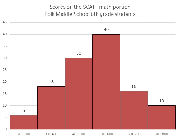
Refer to the above graph. Carla, a sixth grader at Polk, outscored 101 of the students who took the test. Which of these could her score have been?
Refer to the above graph. Carla, a sixth grader at Polk, outscored 101 of the students who took the test. Which of these could her score have been?
 students achieved scores between 200 and 600, and Carla outscored all of them.
 students achieved scores between 200 and 700. However, Carla did not outscore all of them.
Carla's score had to have been between 600 and 700, so of the five choices, 660 is the only possible one.
Carla's score had to have been between 600 and 700, so of the five choices, 660 is the only possible one.
Compare your answer with the correct one above
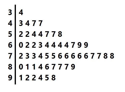
Above is a stem-and-leaf representation of the scores on a test administered to a group of students. What was the midrange of the scores?
Above is a stem-and-leaf representation of the scores on a test administered to a group of students. What was the midrange of the scores?
The midrange is the mean of the highest and lowest scores.
Each "stem" in the left column represents the tens digits of the scores; each of the numbers in its row, or "leaf" represents the units digits. The lowest score is represented by the 4 "leaf" in the "3" row - that is, it is 34 - and the highest score is represented by the 8 "leaf" in the "9" row - that is, 98. The midrange is therefore
Compare your answer with the correct one above
Refer to the above bar graph.
How many students at Polk Middle School scored above 550 on the math portion of the SCAT?
Refer to the above bar graph.
How many students at Polk Middle School scored above 550 on the math portion of the SCAT?
The dividing points of the intervals used to classify students on this graph occur at multiples of 100. No details are given for each interval beyond the number of students who scored in it, so, for example, within the interval 500-600, it is not made clear how many of the 40 students scored above or below 550. The answer is that insufficient information is provided.
The dividing points of the intervals used to classify students on this graph occur at multiples of 100. No details are given for each interval beyond the number of students who scored in it, so, for example, within the interval 500-600, it is not made clear how many of the 40 students scored above or below 550. The answer is that insufficient information is provided.
Compare your answer with the correct one above