Display data in graphs to describe weather during a season - 3rd Grade Science
Card 0 of 10
Which answer choice correctly graphs the information from the temperature portion of the weather data table?

Which answer choice correctly graphs the information from the temperature portion of the weather data table?
The correct graph has to match the values from the data table correctly. The graph should only display information from the temperature portion of the graph, but some of them have the information with the rainfall section or the wrong data input.
The correct graph has to match the values from the data table correctly. The graph should only display information from the temperature portion of the graph, but some of them have the information with the rainfall section or the wrong data input.
Compare your answer with the correct one above
The year is split into four seasons. Spring is characterized by cooler temperatures that start to increase as it gets closer to summer. The summer is hot. The fall begins to cool down, and lower temperatures are noticeable as winter approaches. In the wintertime, temperatures are at the lowest, and it is frigid.
Kim graphed the average temperatures of each season in her hometown. Which bar represents the season of winter?
This is a bar graph and it is a way to display data from a table, experiment, or calculations. This graph represents the average temperature of the four seasons in Kim's hometown. Winter is described as the time of year with the lowest temperatures and very cold. "Season 4" is shown on the graph with the lowest temperatures so this is winter.
This is a bar graph and it is a way to display data from a table, experiment, or calculations. This graph represents the average temperature of the four seasons in Kim's hometown. Winter is described as the time of year with the lowest temperatures and very cold. "Season 4" is shown on the graph with the lowest temperatures so this is winter.
Compare your answer with the correct one above
The year is split into four seasons. Spring is characterized by cooler temperatures that start to increase as it gets closer to summer. The summer is hot. The fall begins to cool down, and lower temperatures are noticeable as winter approaches. In the wintertime, temperatures are at the lowest, and it is frigid.
Kim graphed the average temperatures of each season in her hometown. Which bar represents the season of spring?
This graph is called a bar graph. It is a visual way to represent data from a table or chart. Spring was described as a season with rising temperatures, so it would be warmer than fall and winter. Spring leads up to summer, so it would have lower temperatures than summer. Season 1 is spring because it meets all the criteria described, and when reviewing the graph, it would be the most reasonable response.
This graph is called a bar graph. It is a visual way to represent data from a table or chart. Spring was described as a season with rising temperatures, so it would be warmer than fall and winter. Spring leads up to summer, so it would have lower temperatures than summer. Season 1 is spring because it meets all the criteria described, and when reviewing the graph, it would be the most reasonable response.
Compare your answer with the correct one above
Bradley graphed the average temperature in his hometown for each month. August is the hottest month of the year. Is August in the summer, spring, fall, or winter?

Bradley graphed the average temperature in his hometown for each month. August is the hottest month of the year. Is August in the summer, spring, fall, or winter?
August is in summer. It is the hottest season of the year, and August is the hottest month of the year in his hometown. Based on the graph May, June, and July are increasing in temperature to reach a peak in August. It drops off in September as fall begins.
August is in summer. It is the hottest season of the year, and August is the hottest month of the year in his hometown. Based on the graph May, June, and July are increasing in temperature to reach a peak in August. It drops off in September as fall begins.
Compare your answer with the correct one above
According to Terry's graph which season to do the months of November, December, and January represent?

According to Terry's graph which season to do the months of November, December, and January represent?
This is a bar graph used to display the average temperatures of Terry's hometown each month in a more clear and easy to understand way. The months of November, December, and January have the lowest temperatures of all the displayed months. Winter has the coldest temperatures of all the seasons, so these months must be winter.
This is a bar graph used to display the average temperatures of Terry's hometown each month in a more clear and easy to understand way. The months of November, December, and January have the lowest temperatures of all the displayed months. Winter has the coldest temperatures of all the seasons, so these months must be winter.
Compare your answer with the correct one above
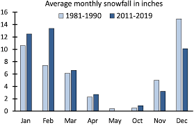
This graph describes the average snowfall in inches that occurs in Madison, Wisconson. There are only eight months listed on the x-axis of the graph. Which season is not represented?
This graph describes the average snowfall in inches that occurs in Madison, Wisconson. There are only eight months listed on the x-axis of the graph. Which season is not represented?
This graph has left out the months of June, July, August, and September. These months fall during the summer. Summer is the warmest season and the least likely to have any snowfall. There is no reason to graph the data if the total inches were zero.
This graph has left out the months of June, July, August, and September. These months fall during the summer. Summer is the warmest season and the least likely to have any snowfall. There is no reason to graph the data if the total inches were zero.
Compare your answer with the correct one above
The graph below shows the number of tornado reports across the United States in one year. What pattern can be identified from the chart below?

For reference:
Winter: December 21 - March 20
Spring: March 20 - June 20
Summer: June 20 - September 22
Fall: September 22 - December 21
The graph below shows the number of tornado reports across the United States in one year. What pattern can be identified from the chart below?
For reference:
Winter: December 21 - March 20
Spring: March 20 - June 20
Summer: June 20 - September 22
Fall: September 22 - December 21
This bar graph depicts the number of tornado reports across the US during 2019. From March until May, there is an uptick in the number of tornado reports. These months fall during the summer. The graph can help make this information easier to read and visually show trends or patterns.
This bar graph depicts the number of tornado reports across the US during 2019. From March until May, there is an uptick in the number of tornado reports. These months fall during the summer. The graph can help make this information easier to read and visually show trends or patterns.
Compare your answer with the correct one above
The graph below shows the number of tornado reports across the United States in one year. Which seasons had the fewest tornado reports?
For reference:
Winter: December 21 - March 20
Spring: March 20 - June 20
Summer: June 20 - September 22
Fall: September 22 - December 21
The graph below shows the number of tornado reports across the United States in one year. Which seasons had the fewest tornado reports?
For reference:
Winter: December 21 - March 20
Spring: March 20 - June 20
Summer: June 20 - September 22
Fall: September 22 - December 21
This bar graph provides a visual way for trends and patterns to be seen within complex data. The graph shows how many tornado reports there were each month across the United States. The seasons with the fewest reports were winter and fall. The graph makes it easier to see which months have a higher number of reports and which months have fewer.
This bar graph provides a visual way for trends and patterns to be seen within complex data. The graph shows how many tornado reports there were each month across the United States. The seasons with the fewest reports were winter and fall. The graph makes it easier to see which months have a higher number of reports and which months have fewer.
Compare your answer with the correct one above
The graph below shows the number of hail reports across the United States in one year. What pattern can be identified from the chart below?

For reference:
Winter: December 21 - March 20
Spring: March 20 - June 20
Summer: June 20 - September 22
Fall: September 22 - December 21
The graph below shows the number of hail reports across the United States in one year. What pattern can be identified from the chart below?
For reference:
Winter: December 21 - March 20
Spring: March 20 - June 20
Summer: June 20 - September 22
Fall: September 22 - December 21
This bar graph is a great way to represent complex data and make it easier to visualize trends or patterns. This specific graph represents the number of hail reports each month of 2019. The highest number of reports are during May and into June, which fall during spring. Many places experience thunderstorms and tornadoes in the spring, and hail is a byproduct of those storms.
This bar graph is a great way to represent complex data and make it easier to visualize trends or patterns. This specific graph represents the number of hail reports each month of 2019. The highest number of reports are during May and into June, which fall during spring. Many places experience thunderstorms and tornadoes in the spring, and hail is a byproduct of those storms.
Compare your answer with the correct one above
The graph below shows the number of hail reports across the United States in one year. Which seasons had the fewest number of hail reports?
For reference:
Winter: December 21 - March 20
Spring: March 20 - June 20
Summer: June 20 - September 22
Fall: September 22 - December 21
The graph below shows the number of hail reports across the United States in one year. Which seasons had the fewest number of hail reports?
For reference:
Winter: December 21 - March 20
Spring: March 20 - June 20
Summer: June 20 - September 22
Fall: September 22 - December 21
This bar graph is a great way to represent complex data and make it easier to visualize trends or patterns. This specific graph represents the number of hail reports each month of 2019. The months with the fewest hail reports are November, December, January, and February. These months fall during the fall and winter seasons.
This bar graph is a great way to represent complex data and make it easier to visualize trends or patterns. This specific graph represents the number of hail reports each month of 2019. The months with the fewest hail reports are November, December, January, and February. These months fall during the fall and winter seasons.
Compare your answer with the correct one above